Your ultimate cheat sheet on gradients and how to use them to power up your designs.
Gradients defined
At their core, gradients are smooth transitions between colors, which can range from subtle shifts in the same hue to bold blends of distinct shades. The technique dates back to the 1880s with Jules Chéret’s introduction of three-stone lithography, paving the way for the colorful, dynamic designs we see today.
Types of gradients
1. Linear gradient
The linear gradient stands as the simplest and most straightforward type to use. It features a color transition along a straight path, which can extend vertically, horizontally, or diagonally.

The reflected gradient, a variation of the linear gradient, begins with a linear color progression at its core. Colors converge at a central point, then fan out in symmetrical gradients on either side.

2. Radial gradient
This gradient features a color transition that radiates outwards in a circular or ellipsoidal pattern from the center. Radial gradients excel at drawing attention to specific design elements by encircling them with a halo effect, effectively guiding the viewer’s focus toward these points.

3. Angular gradient
Also known as a conic gradient, it creates a 3D effect thanks to its 180° color transition revolving around a central point. This makes it appear like you’re looking at a cone-shaped object from above, hence the name of the gradient.

4. Diamond gradient
Like the radial gradient, this type also disperses color from a central point. However, it uniquely expands in the shape of a cross, forming a diamond-like pattern rather than a circle.

5. Mesh gradient
This is one of the most popular type of gradients you can create. The catch? You’ll need Adobe Illustrator to dive into this creative playground. Imagine using the Mesh Tool to lay down a net of possibilities over your design. Here’s where it gets fun: the color comes alive from the anchor points you choose within this mesh. And with a bit of magic from Bézier curves, you can twist and turn this mesh, watching as your design takes shape in the most delightful way.

90% of the time, when you see gradients with clean lines in them, those are mesh gradients. Those clean curves appear when one colored anchor point gets close to another anchor point.
If you’re not ready for a $20/month commitment, you can make quick and simple mesh gradients using free online tools like Mesh-y or try to play around with Figma plugins like Mesh Gradient.
6. Shape blur gradient
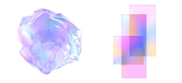
Shape blur gradients are crafted from whimsical, free-form shapes combined with a blur effect, serving as a more relaxed cousin to the mesh gradient.
In this style, the sky’s the limit on the number of shapes you can use, whether they’re uniform or wildly different. By duplicating and layering these shapes, you can dial up the color intensity, or spread them out for a gentler, more nuanced blend of hues.

7. Freeform gradient
The freeform gradient, hidden like a treasure in Adobe Illustrator, offers a swift route to crafting intricate and captivating gradients with ease. Much like its mesh gradient sibling, colors radiate from various anchor points.
Yet, the freeform gradient stands out because you can freely maneuver these points, altering the gradient dynamically as your design evolves. Feel free to add as many points as your heart desires, link them to weave color paths, and tweak their distribution to perfect your visual masterpiece.

8. Multiple gradients
Multiple gradients are where all the fun’s at. It’s when you apply multiple basic gradients to a single shape to create a complex gradient pattern. It can be a combination of, say, several radial gradients and a linear gradient or a diamond gradient accompanied by multiple reflected gradients. By using multiple simple gradients within one shape, you can add more depth and make color transitions more intricate.

Wait, where’s the aurora gradient?
This particular gradient can actually be seen as a special version of either the shape blur, mesh, or freeform gradients. Choose any of these methods to achieve the effect you’re after. Inspired by the mesmerizing natural spectacle of the aurora borealis, or northern lights, the aurora gradient aims to capture its ethereal beauty.
Since the real polar lights vary in appearance, not always presenting streaky patterns, you have the flexibility to create a gentler, airbrushed effect with the shape blur, or opt for more defined lines with the mesh. The freeform gradient gives you the tools to explore both styles, allowing you to craft a visual homage to this natural wonder.

How gradients can enhance your design
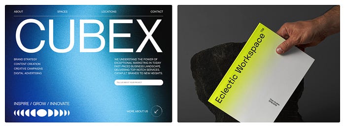
1. Make a color palette more fun and eye-catching without overdoing it
By using gradients, you can even turn a 3-shade neutral color palette into something refreshing. Gradual transitions between different hues make it look like the palette is richer than it really is. This gentle, non-overwhelming color play you can achieve with gradients almost always looks more alluring than a composition made up of monochrome shapes.
2. Draw the viewers’ attention to a specific element
Gradients can help you create a halo effect around an object, subtly highlighting it and shifting the viewers’ gaze towards it. Radial and diamond gradients are especially useful in this case, as they can act as a light, non-overpowering frame around an element.

3. Add volume/dimension
Subtle color transitions through gradients instantly add depth, transforming 2D designs into 3D illusions. Gradients mimic various lighting effects: conic gradients replicate side lighting, radial and diamond gradients suggest backlighting, while linear gradients imitate overhead or underlighting, enhancing the design’s dimensional feel.

4. They just look cool!
It’s undeniable that even a simple gradient makes any design look more sophisticated. There is something inexplicably mesmerizing about these mellow color shifts. Animated or static, shade transitions are an infallible design choice that works for nearly anything.

How to use gradients
The beauty of gradients lies in their flexibility, offering countless ways to incorporate soft color blends into your work. Beyond the obvious choice of using them as a background, gradients open up a world of creative possibilities.
1. As a background
Gradient backgrounds stand as a timeless favorite, effortlessly enhancing visual appeal without adding clutter. They’re a surefire option in graphic design, perfect for everything from UI design to concert posters. Integrating a gradient is straightforward in most design apps; simply changing the background fill to a gradient and choosing your colors does the trick.

2. As a shape fill
Gradients come to the rescue when a shape seems too dull with a solid color fill. Applying a gradient can instantly give it depth, making it pop and capture attention. This technique is particularly useful for CTA buttons, transforming them into eye-catching elements that guide users towards taking action.

3. As a text fill
Don’t get this wrong, an entire 200-word paragraph filled in with a gradient is not a good idea. Gradients as text fills work wonders when you want to highlight one specific word or phrase. It can be a company logo, an important CTA button, a special offer announcement, etc.

4. As a filter over photos and images
The era of overly vibrant, contrast-heavy gradient filters is behind us. Fear not if those intense looks weren’t your style. Modern gradient filters, far from the extremes of filters like Instagram’s ‘Rio de Janeiro,’ can be finely adjusted for subtlety. By tweaking the overlay settings, any gradient can become a sophisticated photo filter, enhancing UI backgrounds and accents with a touch of elegance.

Gradients also shine in the form of gradient maps, a technique that redefines a picture’s color palette to match a selected gradient. For example, applying a purple-to-orange gradient map changes your image’s highlights to orange and shadows to purple, creating a captivating visual effect that breathes new life into photos.
5. As a graphic element or effect
Gradients don’t always have to be used as fills for other design components — they can be separate design elements. You can add gradients to mimic various lighting effects and create magical visual effects.

Where to use gradients
1. App design
Just a dash of gradient can really make your app’s interface pop! Loads of apps out there jazz up their look with cool gradient backgrounds and buttons. It’s like giving directions with colors, guiding users’ eyes right where you want them, and highlighting the important bits. And hey, why stop there? Toss in some gradient icons too, and watch your UI go from neat to downright eye-candy. It’s all about making those user experiences a bit more special.

2. Web design
At this point, gradient backgrounds have become a staple in web design, and for good reason. They’re the secret sauce for keeping your UI clean yet far from boring. The moment you introduce gradients, your website transforms, becoming more lively and welcoming.
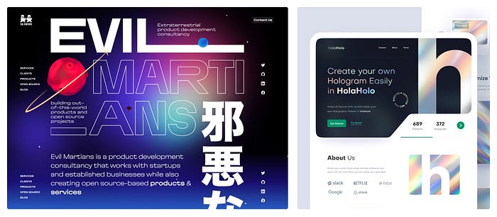
And it’s not just about backgrounds. Adding gradient graphics can elevate the design even further. By strategically placing gradients around key elements, you can subtly guide the user’s gaze exactly where it’s needed most, enhancing both the aesthetic appeal and the functionality of your site. It’s a smart way to draw attention and make critical features pop without overwhelming your audience.
3. Poster design
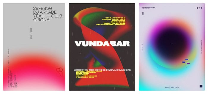
When it comes to poster design, gradients are many artists’ go-to choice. By using a gradient background or shape, you can easily add depth to the composition while keeping it uncluttered. With minimalism in poster design still being very much in, gradients in posters are extremely common.
4. Social media
Social media posts often call for something extra catchy and visually appealing. Whether it’s a thumbnail for a video, an Instagram story template, a Facebook banner, or something else, you can see gradients all over social media. They are fast and easy to make, which is exactly what you need when crafting visuals for your socials.

5. Brand identity and product packaging
Gradients are popular outside the digital world, too: product packaging often uses color shifts for a more exquisite, sleek look. Some brands go further than just using color grading for their packaging and make gradients a signature element of their identity. From logo to website design to brand merchandise, gradients can help create a clean, elevated brand image.

6. Logo design
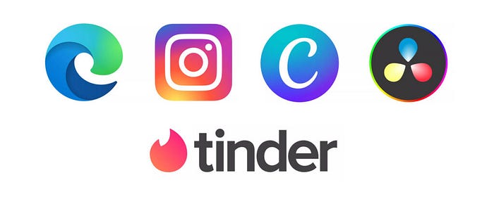
One of the best ways to make a logo pop is to add a gradient to it. Some of the most iconic logos that the majority of users would recognize in an instant have a gradient in them. Microsoft Edge, Instagram, and Tinder are among the most famous examples of memorable gradient logos.
Originally published at https://blog.icons8.com on September 4, 2023.
