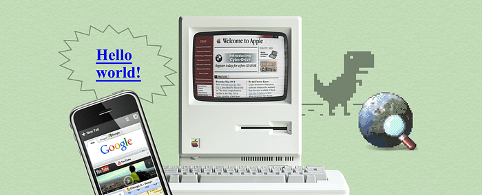
Chaos, disharmony, rock and roll, and absolutely no rules in design. But still, it was charming like the Wild West.
Today UX/UI design has become almost an exact science, with an expert community, recognized authorities, and trends to follow. But 20 years ago, web design had no rules. UX evolved along with the internet itself and the appearance of the mobile internet.
Let’s take a tour back to the early 2000s and have a look at how web design was developing and how diverse it was until flat design overcame it all.
Stone Age of web design
The first internet revolution happened in the early 2000s. The global network was no longer the privilege of technically advanced geeks and became available to anyone with a personal computer.
Nowadays, you can carry the internet in your pocket. But 20 years ago you could only access it from a PC using a dial-up connection. This process involved telephone wires and was accompanied by this magical sound.
It was far from the internet as we know it today:
- Speed was extremely low. A simple website with no animation could take up to a minute to load. And you had to wait all night to download a movie.
- Internet access was limited by traffic or even by time. And it was cheaper and faster at night.
- Web design did not exist as a thing. Professional web designers were rare species. Developers made the websites by themselves using only HTML code and it was up to them how these sites would look.
Web sites were mostly text-based back then. Moreover, many people purposely turned off images in their browsers to save traffic.
Here’s an example of a typical site from the early 2000s.

Typical signs of the websites in the dawn of web design were:
- weird color and font combinations
- glittering images
- animated pixel art
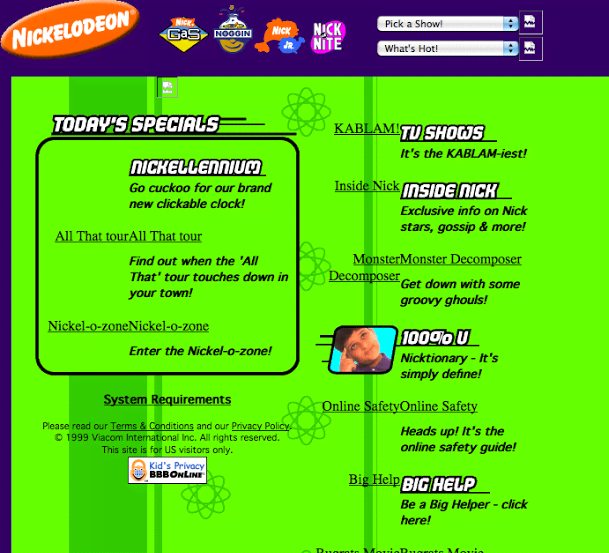
There were no streaming platforms or torrents. People searched for music and videos on special websites. There were no menus, search bars, filters, or sorting tools. Manual scrolling was the only option. But despite all this, websites with media content were extremely popular.

Here is the website of Britney Spears, a top pop star of the time.

And here’s what the Apple website looked like.

A few words about browsers in the 2000s. There were no tabs. You had to open a new window for each website. It was hardly possible to open a dozen sites at once, considering the RAM size of those computers. On the other hand, the developers did not have to think about responsive design and other complicated things. All users surfed the web from monitors with the same screen resolution.
You can still feel how internet surfing was back in the early 2000s. Go to OldWeb.Today, choose any browser emulator, and type a familiar URL, for example, apple.com or google.com. You can try to open a present-day website with this tool, but you probably won’t succeed.
To get a better sense, you can check Web archives or Web Design Museum. Touch the history.
2003–2006. First design standards
The companies began to realize that their website is not a business card but a business tool. Some website creators got concerned with the usability issues once they found out that users were not reading, but rather scanning web pages. The concepts of F-pattern and Z-pattern appeared.
In 2003 came WordPress, a content management system based on PHP and MySQL. Creating websites was no longer the privilege of people with a technical background.
WordPress used a template-based system, so users could customize website design and functionality even without coding skills.
And then came social media such as Facebook, LinkedIn, MySpace.

It was a period when everyone wanted to put as much information on the screens as possible. At the same time, website creators had to think about readability and navigation. Ascetic design with soft colors, shadows, and a modest palette replaced the festivity of colors.
In 2005, YouTube was launched. The story of the world’s largest video hosting service began with an 18-second “Me at the zoo” video by Jawed Karim,one of the YouTube founders . You can watch the top 10 oldest videos on YouTube here.

User-generated content rapidly flooded the web. And with the rise of social media, people were eager to share it. So in the mid-2000s web design has become more content-focused. The era of web 2.0 began.
2007–2010. Mobile internet and the rise of Skeuomorphism
By the mid-2000s, mobile had developed into a separate branch, but it had little interest from the general user. Most websites didn’t have a mobile version because most of the internet surfing was on personal computers. Yet, some companies created WAP versions of their sites.
Here’s what they looked like.
Everything changed in 2007 when the first iPhone came out. It featured the first full-fledged mobile browser Safari.
It was a real breakthrough! The need to adjust content for different devices has emerged. After the iPhone’s success, Apple became a trendsetter in user interfaces. Their favorite feature was to make the interface elements look most realistic. And that trend has spread from mobile to web design. Skeuomorphism ruled everywhere. Perhaps at that time, the borderline between web and mobile began to fade.
2010–2017 Goodbye skeuomorphism, hello flat design
In 2010, Ethan Marcotte introduced the concept of responsive web design. He suggested showing the same content on all devices but using different layouts to present it. The visual look of web and mobile pages has become quite similar.
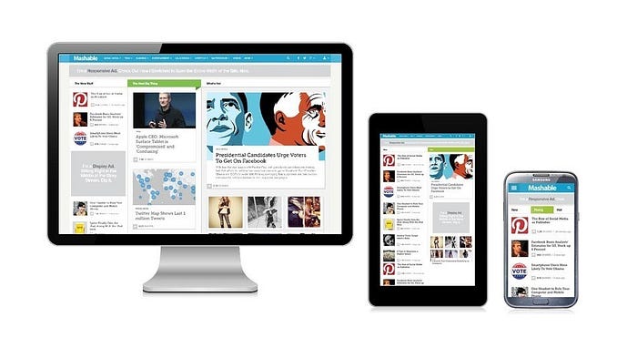
Simplification became trendy. Skeuomorphism with its realistic UI elements started losing its position.
Microsoft made everyone pay attention to the minimalistic card-like design. Its key features were simplicity, solid colors, clean typography, a minimum number of lines, and a lot of air.
Back then it was a torture for designers to make responsive designs. Their main tool was Photoshop, which worked with raster images only and was extremely hungry for system resources. In 2010, Sketch came out and made creating responsive design much faster, since it was a vector-based app.
Skeuomorphism hung on for a while, but soon flat design replaced it everywhere. It made creating interfaces faster and more cost-effective so the practical value prevailed. Designers focused on content rather than beauty. As in the early 2000s, websites’ visual look became text-centric.

Interfaces became two-dimensional. Flat squares and ovals replaced realistic buttons.
What comes next?
After almost 30 years, it seems that the history of the internet is as cyclical as history in general.
Brutalist web design is trendy again.

…as well as weird color and font combinations.
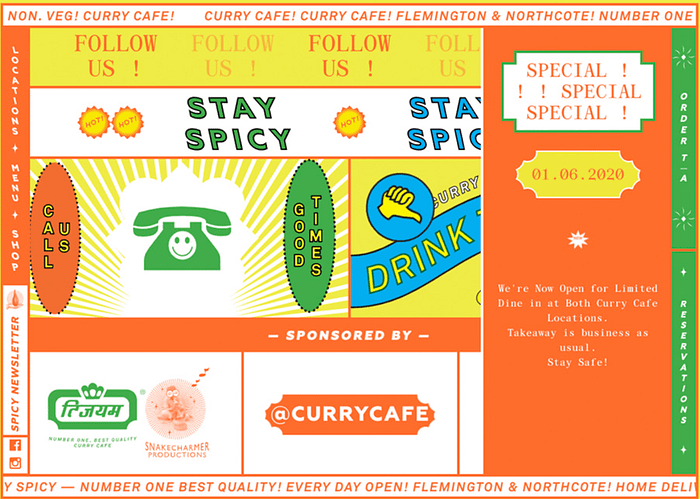
Most of the design media have noted the trend for nostalgia. We are revisiting the web 1.0 era with decades of collective development experience and find it fascinating.
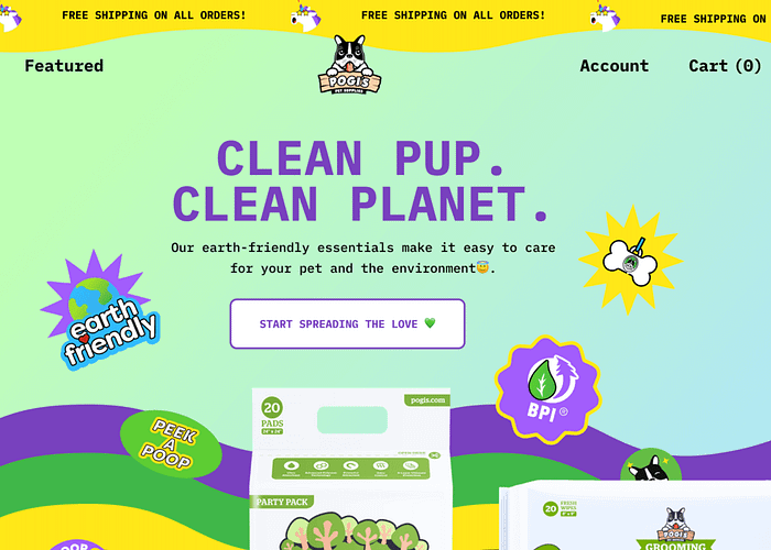
With the growth of no-code technologies another trend from the past returns. We are seeing the designer and developer professions merging as it was at the dawn of the internet in the early 2000s.
Speaking of a more distant future, the Zero UI era is coming and it makes UX/UI designers move away from just visual thinking. Today users can control their devices with voice and gestures. Decades from now, devices would probably be able to get signals straight from our brains. Elon Musk is preparing to test brain chips on humans, while other companies are creating devices that can be controlled by the mind. So studying the basics of biology and behavioral psychology will become more important than Figma and Material Design guidelines.
We have gradually moved from PCs to mobile devices, and now chips are being embedded right into us, making us the new UI. Does it mean the end of the history of the internet as we know it, or are we heading into another cycle of rethinking the past?
Read also:
