Ye olde typography: fonts older than your great-great-great-grandpa
Long before digital fonts, typography was an art form crafted by hand. Explore historic fonts that predate your ancestors.
Typography really took off with the invention of printing and a growing interest in poster design. Before that, it was mostly utilitarian and book printing-oriented.
Blackletter typefaces were among the first fonts used in printing. They imitated handwriting, which seemed a perfect option for book printing. However, Blackletter took up a lot of space, and to solve this problem, in 1470, Nicolas Jenson introduced the first Roman typeface.
It was a clear, easily readable, considerably more compact serif typeface perfect for printing, which was later named Jenson.

1500s
The legendary Garamond was born in the 1500s. The typeface was named after Claude Garamond, a French type designer and punch cutter. His signature elegant serif typefaces shaped a family of fonts now known as Garamond. Since then, elegant compact serif typefaces have grown in popularity and evolved.

Modern fonts inspired by this era
- Minion by Robert Slimbach (1990)
- Accanthis ADF Std by Arkandis Digital Foundry (2010)
- Crimson Text by Sebastian Kosch (2014)

Use Serif icons to match the Minion font in your designs.

1700s — the era of serifs
Once serif fonts replaced the bulky black letter, they emerged quickly. This era gave us several gold-standard serifs that are still popular in printing and design.
Fonts created in this era
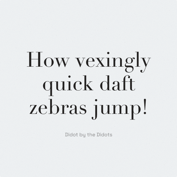
- Didot by the Didots — a French family of printers and punch cutters (late 1700s)
- Baskerville by John Baskerville (1750s)
- Bodoni by Giambattista Bodoni (1790s)


Modern fonts inspired by this era
- Mrs Eaves by Zuzana Licko (1996)
- BaumWell by Manfred Klein (2003)
- Arapey by Eduardo Rodriguez Tunni (2011)

To match the Baskerville font, use Hatch icons for your designs.

1800s
Slab serifs and fat faces
Slab serifs (fonts with massive, long serifs) were gaining popularity and were widely used in typography. Along with them, some creators started to move towards fat faces. Fat face fonts were thick and visually heavy, making them irreplaceable for poster design and newspaper printing.
Art Nouveau
These are soft, delicate, decorative typefaces. In contrast to utilitarian printing typefaces, Art Nouveau fonts were dreamy and elaborate. There was more flow in the lines and more embellishments added to the letters.
Fonts created in this era
- Thorne Shaded by Robert Thorne (1810)
- Antique by Vincent Figgins (1815)
- Aetna by William Hamilton Page (1870)
- Samira by Peter Schnorr (1898)

Modern fonts inspired by this era
- White Bold by James Fordyce (1994)
- Grande Guignol Display by Comicraft (2003)
- San Remo by Dieter Steffmann & Alexandra Gophmann (2007)

Continue your journey of exploring font history with Icons8:
